There’s so much wisdom in this post, I had to share it here:
The Mobile Challenge | The User Experience by Aaron Schmidt (posted by Library Journal on May 6, 2013)
Personal blog: All opinions are only my own, unless you want to borrow them. (he/him)
There’s so much wisdom in this post, I had to share it here:
The Mobile Challenge | The User Experience by Aaron Schmidt (posted by Library Journal on May 6, 2013)
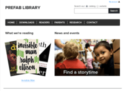
When it comes to making sure that all of our services are available on our library’s website, the best strategy is to make access intuitive and obvious.
The mistake that’s all too easy to make (and all too frequently made) is to assume that this means putting points of access right there on the home page.
At certain point, though, this requires either:
To reiterate what PC Sweeney said: “Too many choices creates confusion.”
Continue reading “Library Website Design, Part III: Give Them Paths to Follow, Not Points to Click”
Consider the way that many library websites handle online database collections: we list every database we have and let the patron find the one they need. We offer alphabetical listings of our databases, we have categorized lists… we offer multiple points of access to try and provide any given patron an option that might fit how they want to interact with the site.
But there’s a fundamental flaw in this use-case:
It puts the burden of identifying and locating appropriate resources on the patron. The general category and topics lists help somewhat – but the patron still needs to decide which category they need to drill through, and then they need to assess each database offered in that category to determine which might best serve their purpose.
Continue reading “Library Website Design, Part II: The Tyranny of Choice, and an Ode to the Reference Interview”
Libraries, by contrast, offer a staggering array of services to a wide variety of users.
How do you design for that? How do you focus your layout and navigation without sacrificing the visibility of all your myriad resources and services? How do you promote certain services without ostracizing patrons who are seeking services that aren’t being promoted?
Continue reading “Library Website Design, Part I: The Trader Joe’s Principle”

I just saw this article online today:
Let’s Hope Snøhetta’s New Robotic Library At NC State Isn’t Run By An Evil Super Computer
I think this library is absolutely gorgeous! I really like how peaceful and bright and comfortable it looks inside.
I find this type of robotic technology fascinating. We know that it works – the Joe and Rika Mansueto Library at the University of Chicago is testament enough to that. Space and storage have been perpetual challenges for libraries for a long, long time. This represents an elegant and cost-effective solution. As one who has long been interested in archival work, I’m excited by the potential this technology has for that field, as well.
Continue reading “On Robotic Libraries and Serendipity”
With all of the changes taking place over at Apple, people are wondering how it will affect the design of their future products – both the external look and the software interface. As a result, skeuomorphism is very much on the minds of systems and UX designers.
Skeuomorphism gets a pretty bad rap among many tech-savy computer folks. It’s kitschy, it’s gimmicky, it’s corny. Some feel that it dumbs down the essential nature of digital technology. By over-emphasizing analog equivalents (equivalencies that are, arguably, false in their foundation) skeuomorphism runs the risk of obscuring many of the things digital technology can do that analog can’t – the aspects of the digital tool for which there is no analog equivalent.
Mashable has a delightfully snarky gallery of some of Apple’s more infamous uses of it:
Say Farewell: Apple’s Skeumorphism Hall of Shame
Many of these criticisms are largely correct. So why am I still a fan of skeuomorphism?
Continue reading “Speaking of Skeuomorphism”
When I was in school to get my MLIS, I had an assignment in my Reference class to observe reference librarians in real-world situations. I sat in at the reference desk at my local branch of the Chicago Public Library over the course of several days. I noticed something odd about the way the reference librarians dressed at this branch: sometimes they dressed in more formal professional attire – long-sleeved, button-up shirts and ties for the men; blouses and skirts, or dresses for the women – but at other times they dressed very casually; sometimes the same librarian would be dressed professionally one day, and the next day casually. I saw no rhyme or reason to this.
Continue reading “Conveying Authority”
Yesterday, the Kansas City Public Library held the first ever Kansas City SirsiDynix Users Group Conference at our Plaza Branch. Representatives from several KC-area library systems and from SirsiDynix met and discussed what the future could hold for ILS systems and library technology.
Web-based services, cloud services, APIs, fully integrated discovery layers, social media integration, the role of mobile apps, patron-driven acquisitions, one-click downloads, the relationship of the library OPAC to the library website…
We’re brainstorming the nature and structure of libraries in the Digital Age.
I came out of the conference with three major take-aways:
Continue reading “Everything, Anywhere, All the Time”
The Kansas City Public Library just posted a new position: User Centered Design Specialist
I love that we’re doing this! I know that it’s become something of a cliché to talk about UX, but the simple fact of the matter is that user experience and interaction design are only going to become more important as we proceed in our Digital Information Age.
The landscape of information access is undergoing radical evolution. We have a wider variety of information accessing technology than ever before: desktop computers, laptops, tablets, smart phones, gaming systems – with different operating systems and coding platforms for each. More importantly, these technologies have created a near-infinite variety in points of access – wherever we can carry our devices (and still have signal) we can access information at will.
Continue reading “User Centered Design: The New Card Catalog for the Digital Information Age”
 The other day, I was talking with some of my fellow librarians, and conversation turned to new technologies and digital information services. As it turns out, some of my fellow librarians are also fellow science fiction fans; naturally, we brought up the SF trope that someday our brains will be wired directly into our computer networks – no more external interfaces, the access and use of digital information will all happen through pure thought!
As is my habit whenever people discuss the concept of direct neural-computer interfaces, I offered my usual words of caution:
“Right, because I really want the blue screen of death IN MY HEAD!”
One of my fellow librarians didn’t get the reference. She’s in her early 20s, and she’s never seen a blue screen of death. She’s never even had a hard drive crash on her. She had no idea what I was talking about.
I should probably update my reference, but somehow, “Because I really want a network crash IN MY HEAD!” lacks the same punch.
