Libraries, by contrast, offer a staggering array of services to a wide variety of users.
How do you design for that? How do you focus your layout and navigation without sacrificing the visibility of all your myriad resources and services? How do you promote certain services without ostracizing patrons who are seeking services that aren’t being promoted?
As a result of these challenges, and because of our fear that we might fail to address every conceivable patron need, too many library websites became giant, bloated, chaotic messes with everything thrown at the patron all at once.
What we’ve learned in the past several years, though, is that this design strategy is virtually guaranteed to fail to address many patron needs successfully. Too much information, too many possible navigation pathways, too many options – all these things obscure what a patron needs to be doing on a library site.
Yesterday, PC Sweeney tweeted a statement from the Computers in Libraries conference that’s the best summary of this problem I’ve read:
“Too many choices creates confusion and ultimately less sales than less choices” #cildc
— pcsweeney (@pcsweeney) April 9, 2013
I’m reminded of an article I read a couple of years ago analyzing the success of the Trader Joe’s grocery store chain:
Inside the secret world of Trader Joe’s – by Beth Kowitt (posted by CNN Money on August 23, 2010)
This article defines what I’ve come to call The Trader Joe’s Prinicple:
Customers may think they want variety, but in reality too many options can lead to shopping paralysis. Studies have found that buyers enjoy purchases more if they know the pool of options isn’t quite so large. Customers accept that Trader Joe’s has only two kinds of pudding or one kind of polenta because they trust that those few items will be very good.
Limited choices provide website patrons with better, more successful, and more beneficial experiences – provided they can trust the choices they have to be well-designed and will get them what they need.
Which is to say, we’ve taken the long way around to come back to the ol’ chestnut:
Keep it simple, stupid.
The Trader Joe’s Principle (K.I.S.S.) has huge ramifications for library website design.
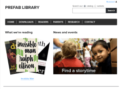
I especially admire the work that Aaron Schmidt is doing along these lines. His radical simplicity may be a bit too much for many libraries (especially large metro-area library systems) but as declarations of principle and proofs-of-concept, we could all do a far cry worse than to follow in his footsteps. The Library One-Pager and Prefab products offered by Influx, the library UX service he operates with Amanda Etches, are some of the purest expressions of simple web design I’ve seen. And I love his ideas for simplifying our online catalog interfaces. His tight focus on patron needs and behaviors, rather than highlighting or advertising library services, is crucial.
It strikes me that the key to simplifying library websites – without sacrificing access to our full range of services and resources – is to fundamentally reconceptualize how this access is supposed to work.
Next Up – Part II: The Tyranny of Choice, and an Ode to the Reference Interview
